Exactpro
Exitus Acta Probat- Client
- Exactpro
- Role
- Multidisciplinary design,
Web & UI/UX - Scope
- Campaign & event graphics, Employer brand,
Product design for Murabex - Year
- 2022–2026
An independent software testing house for the infrastructure global markets run on. Over five years I designed its public face — one template system across campaigns, hiring and five country calendars — and, inside the house, the brand site and product interface for Murabex.
The client
Speaking to exchanges and regulators, and to the testers they hire.
Exactpro has been testing the technology behind financial market infrastructure since 2009: market data and surveillance platforms, clearing and settlement, post-trade systems, the software that stops exchanges from failing quietly. Its motto, Exitus Acta Probat, sits under the logo in every lock-up: the outcome justifies the deed.
That gave the design job two audiences at once and one voice for both. Heads of technology at market infrastructures had to read proof of rigour. The QA community the company recruits and teaches from had to read something worth sharing. Nothing could look like a stock-photo consultancy, and nothing could get loose enough to embarrass a central bank.
The system
Same frame every time. Colour is the only thing that moves.
A testing company publishes constantly: a webinar, a conference panel, a journal paper, a national holiday, a vacancy. The posts land in a feed next to each other, weeks apart, and the only way that reads as one company is if the geometry never argues.
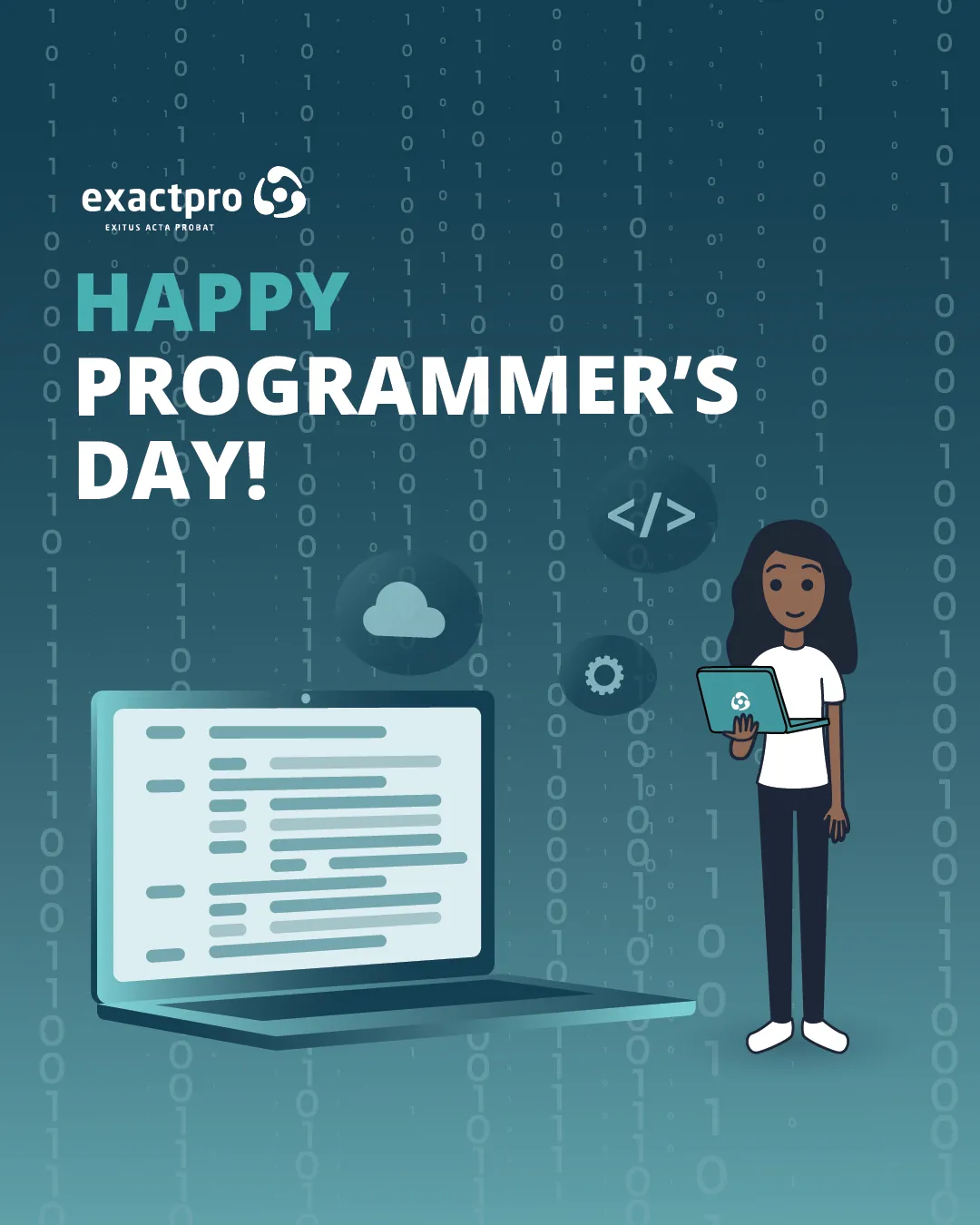
So the frame is fixed and the palette is the variable. Announcements run house teal, thought leadership runs blue, community events violet, hiring purple, the office calendar green. You can tell what a post is before you read it.
Thought leadership
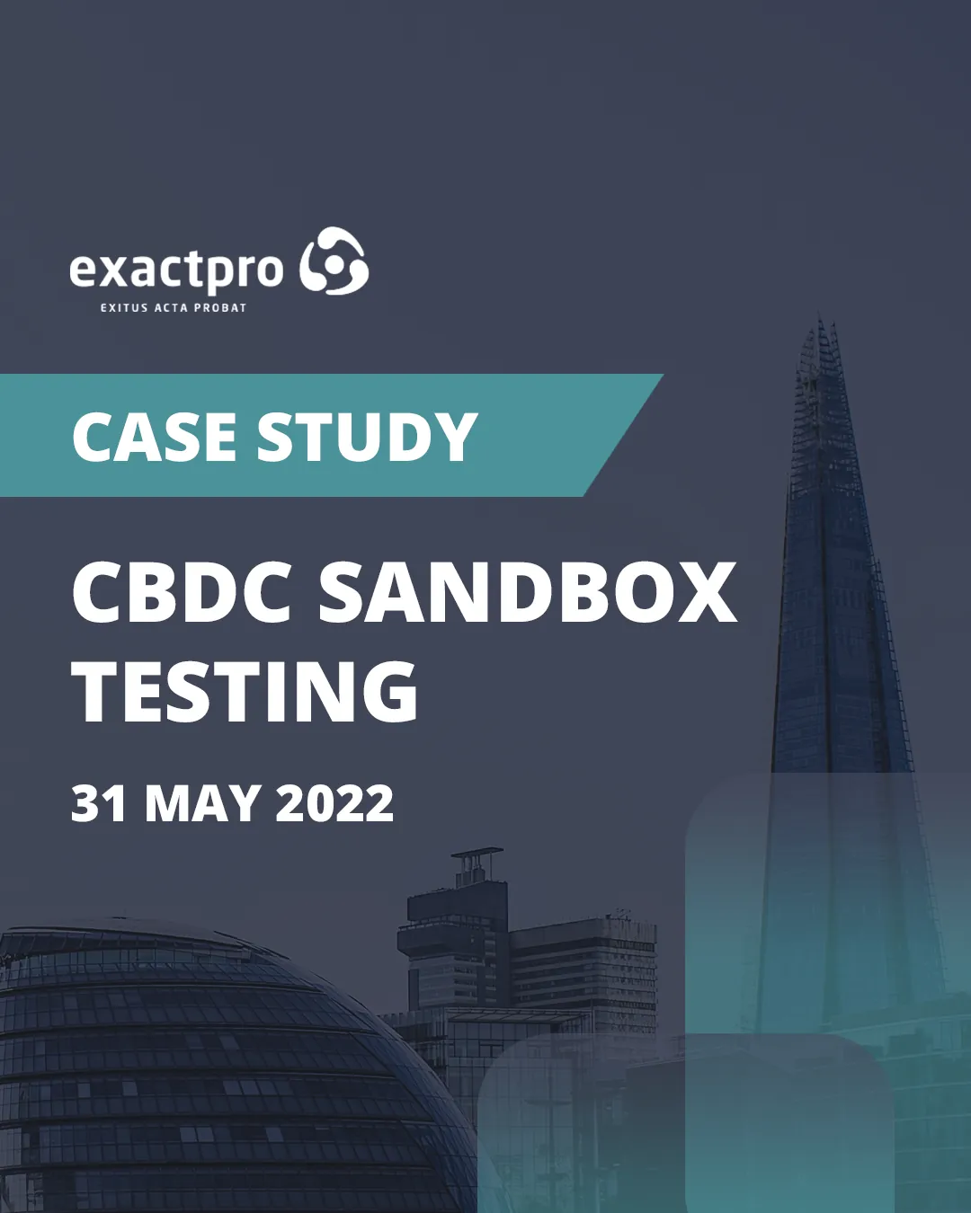
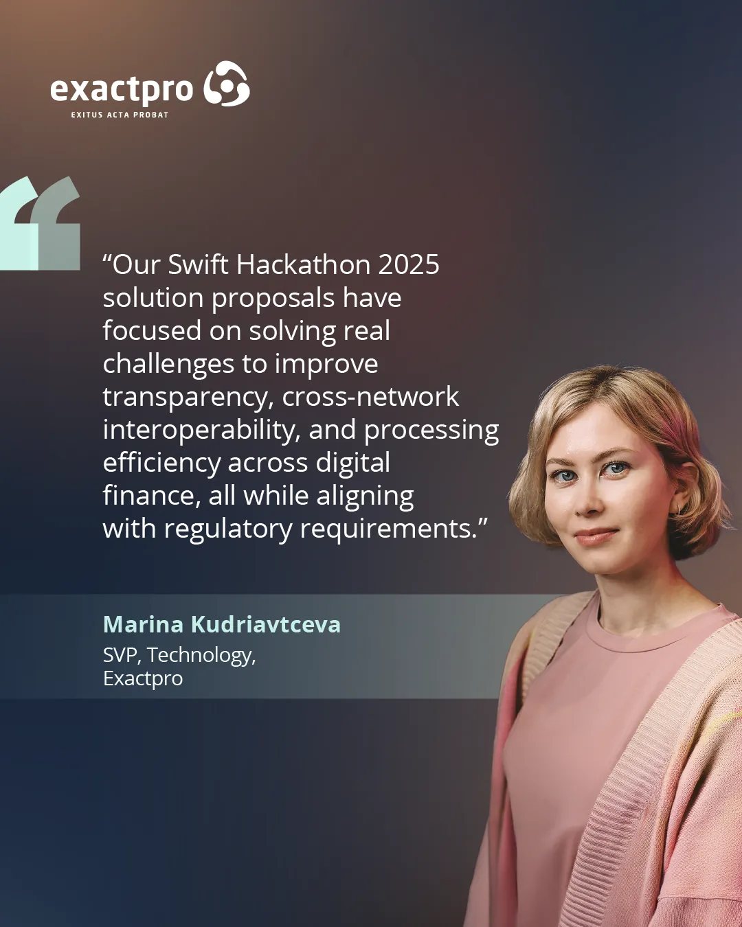
Covers for work that gets read by the people who regulate it.
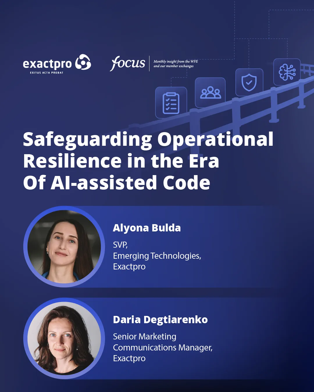
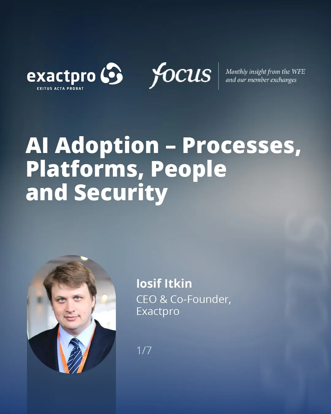
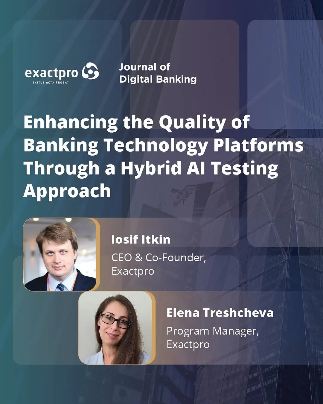
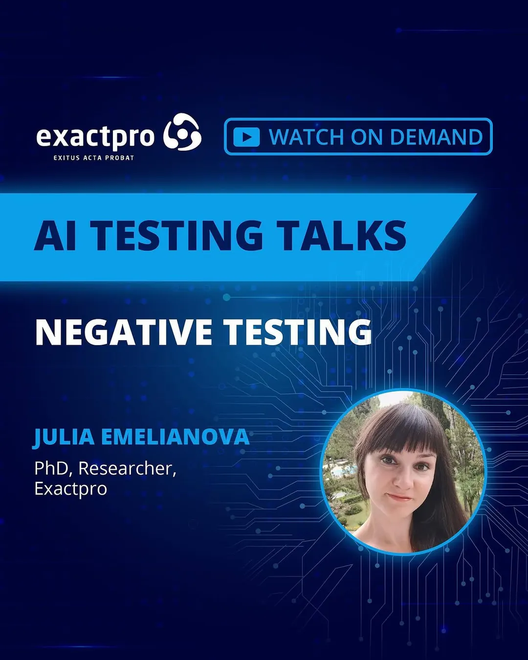
The heaviest stream is publishing: papers in the WFE's Focus and the Journal of Digital Banking, webinars with the BCS, the AI Testing Talks series, sandbox case studies, hackathon debriefs. Each one arrives as a title, a couple of headshots and a deadline.
The covers are built to survive that. A blue register, a photographic ground pushed back until it is texture, and a headline set large enough to be legible as a 150-pixel thumbnail in a LinkedIn feed, which is where most of them are actually seen.

The testing community
Twenty sponsor logos, one poster, no shouting.
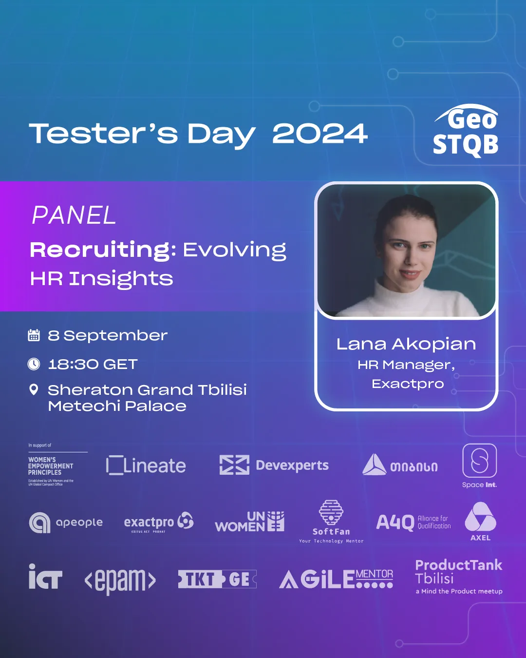
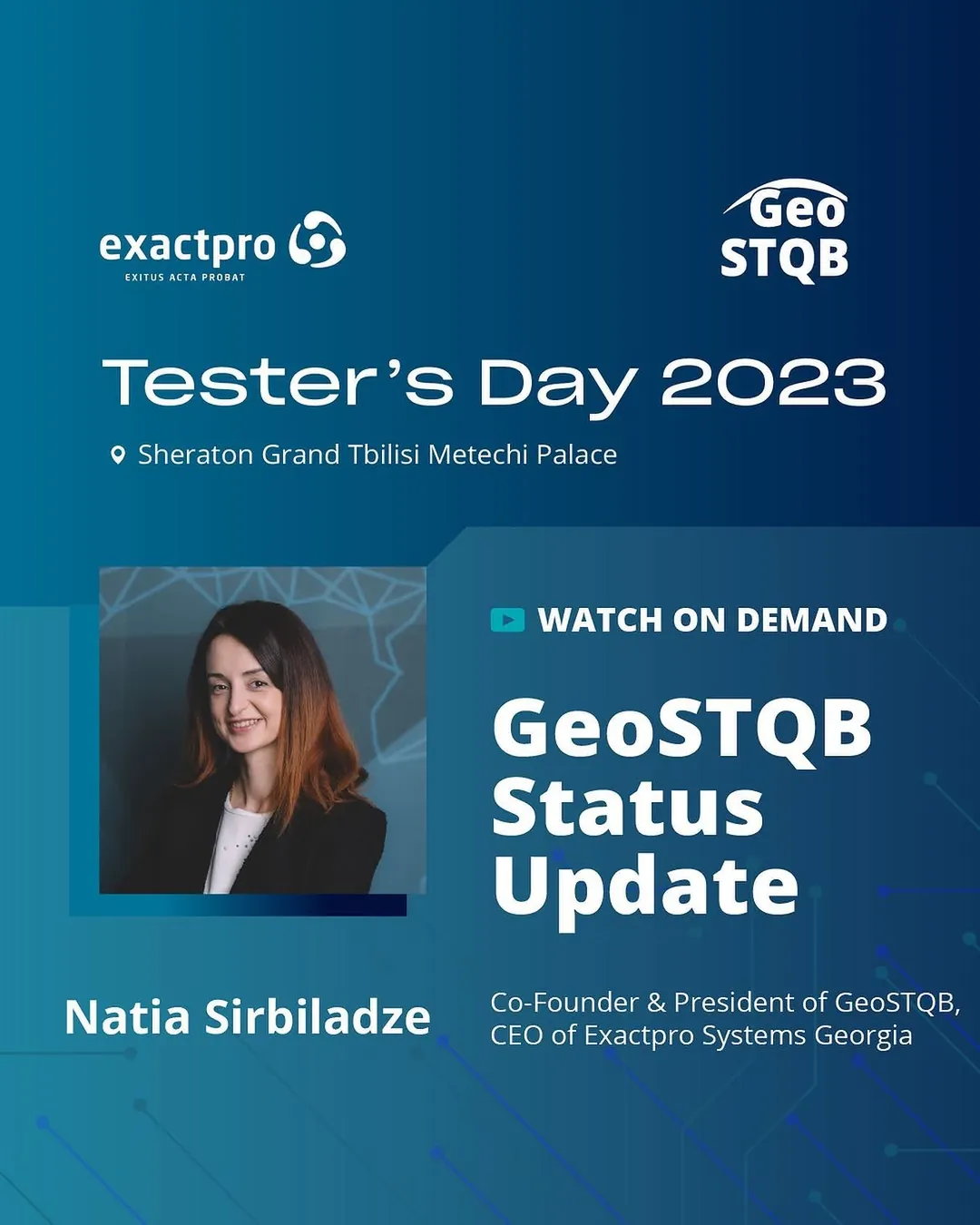
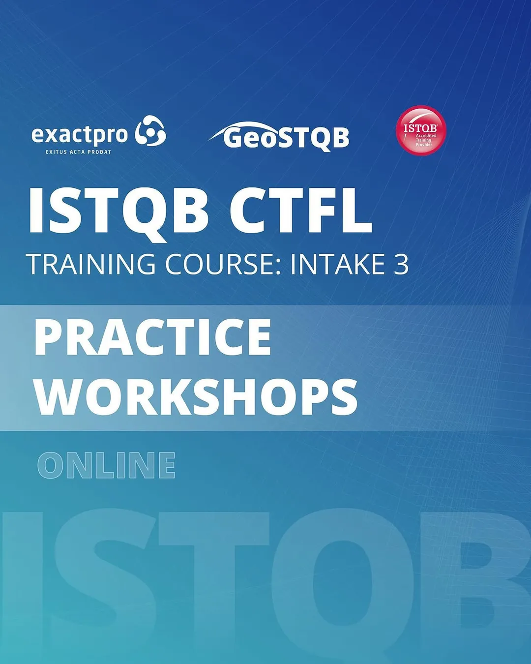
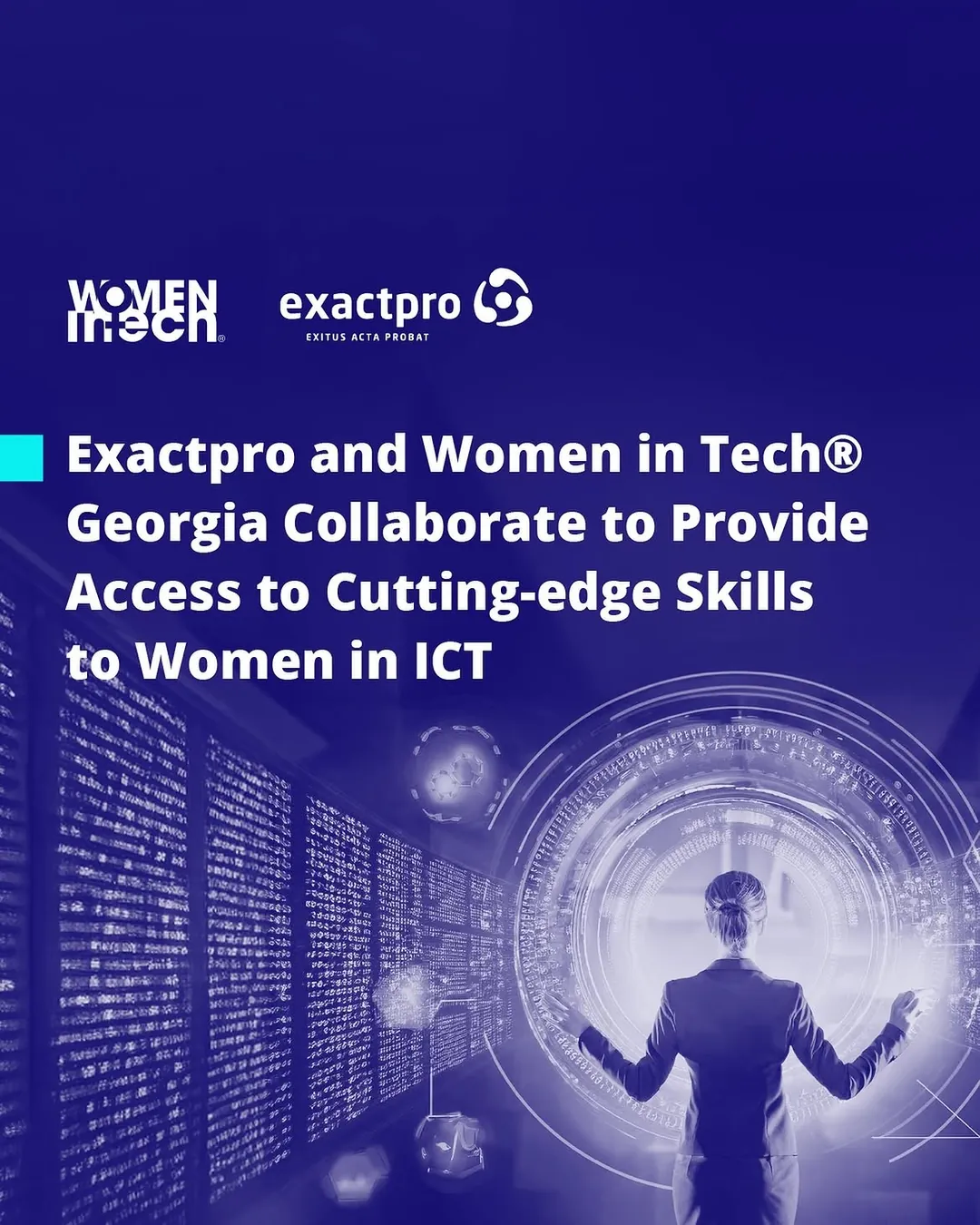
Exactpro's Tbilisi office opened in 2018 and is now the company's largest delivery centre, with 230+ people. The team there founded GeoSTQB, Georgia's ISTQB member board, and runs Tester's Day, certification workshops and a partnership with Women in Tech Georgia. Those events all need posters, and posters that carry partners.
The logo wall is the real problem: twenty marks drawn at twenty different weights, on a gradient, at thumbnail size. They are knocked back to a single white, set on a fixed baseline grid, and optically sized rather than mechanically scaled, so no partner shouts over another and the panel headline still wins the frame.
Employer brand
Hiring posts lead with the city, not the company.
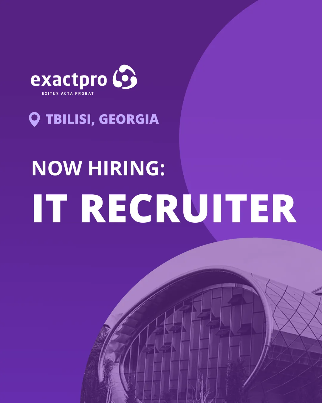
A vacancy competes against every other vacancy in the same feed, and the differentiator is rarely the job title. So the role gets the largest type in the system, the location gets a pin and equal billing, and the ground is a local landmark in duotone, so the post reads as a place before it reads as an ad.
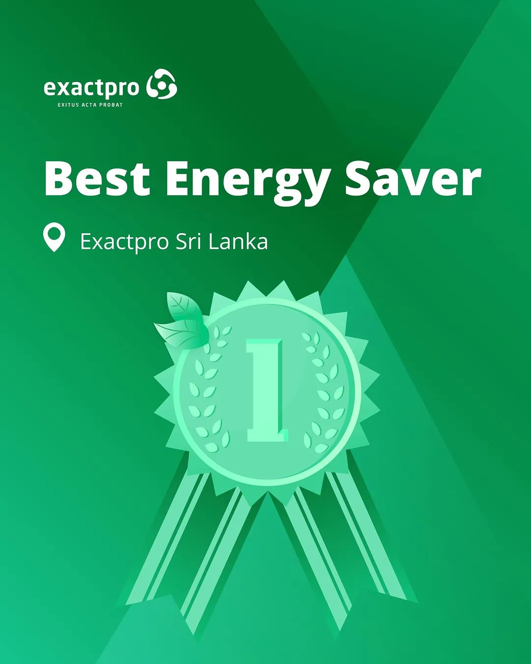
The same restraint carries internal news. When the Colombo office was named Best Energy Saver again, the award became a drawn medal in a single green, not a photograph of a certificate: a recognisable object at thumbnail size, and one more colour the system already owned.
Five calendars
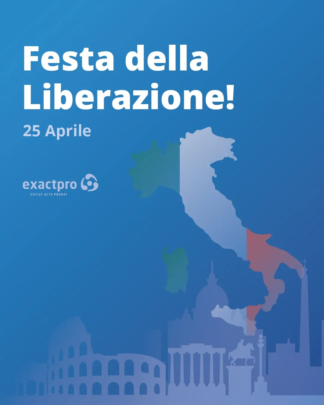
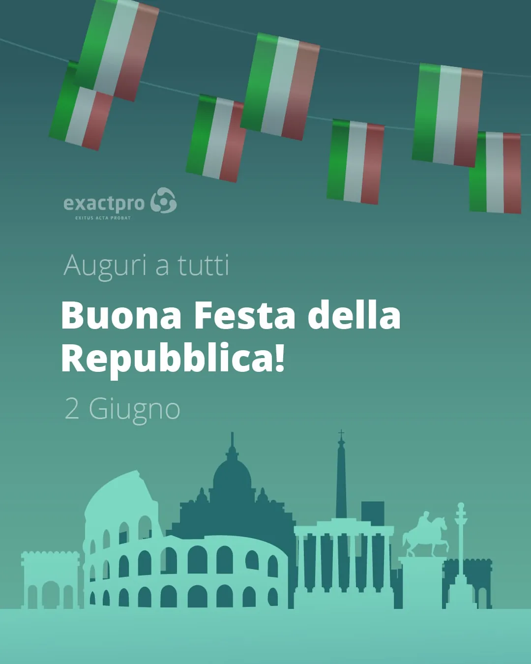
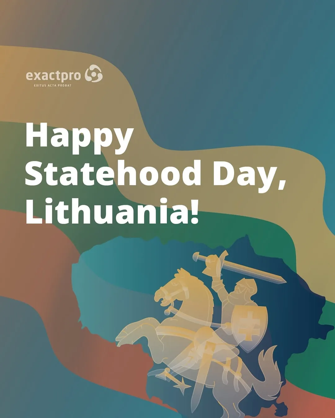
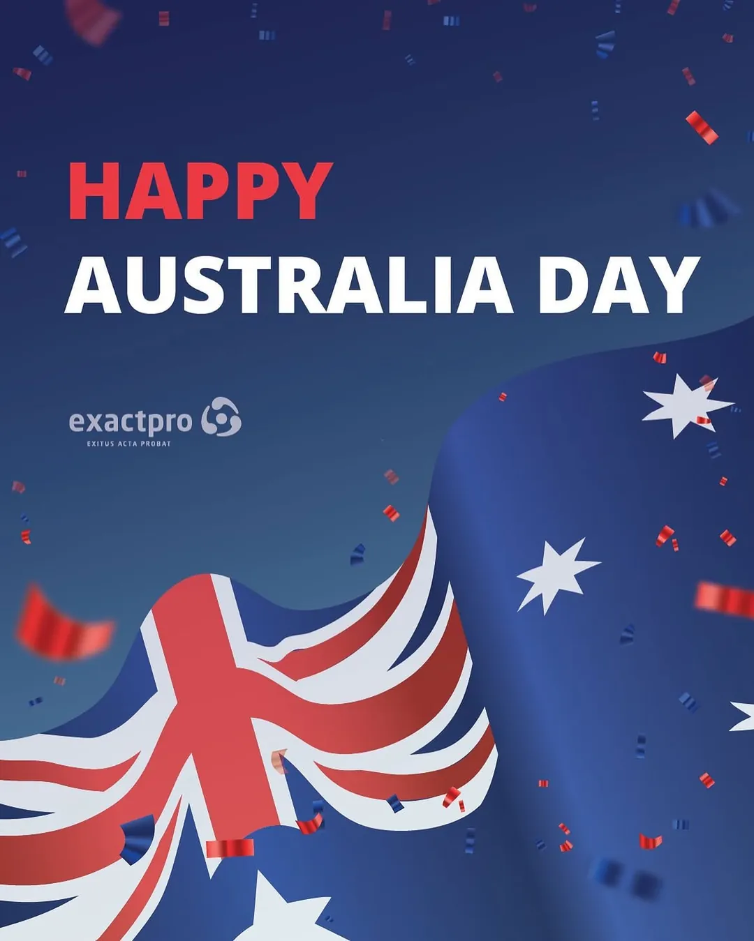
Georgia, Italy, Lithuania, Australia, Sri Lanka: drawn, not stock.
Offices in five countries mean five sets of national days, and a greeting post is the fastest thing in the world to make badly. The rule that keeps them from turning into clip art is one drawn emblem per post, rendered flat in that post's own palette, with the flag reduced to a ground behind it: Svetitskhoveli, the Colosseum, the Vytis knight.
Georgian and Latin run together often, so both are set at matching optical weight rather than matching point size; Georgian's lack of capitals means a headline that is merely scaled to match looks quieter than the English beside it. And once a year th2, which is both the open-source test framework and the name of the office cat, earns a circuit-board portrait, and the company gets to be funny without changing its voice.



Murabex
And inside the same five years, a product: enterprise Islamic finance made to feel calm and precise.
Murabex is a digital finance platform that lets institutions execute Murabaha agreements and pool liquidity through a shared, sovereign ecosystem — connecting local banks, a national exchange and international investors on one trusted rail.
Here the work was product rather than campaign. I led the visual design end to end: the full landing page, the institutional product interface, and every illustration and icon in the system. The brief was to make a dense, regulated, Shari'ah-governed platform feel trustworthy and effortless.
Murabex — landing page
I designed the full landing page, gold on black.
The landing sets the tone: a deep near-black canvas, warm gold gradients, and fine contour line-work drawn from the region's dunes and skylines. The voice is confident, institutional, unhurried.
It moves from the promise — Shari'ah-compliant, community-driven, reliable — into the ecosystem, the participants and the technology, closing on a clear call to request a demo or build a sovereign ecosystem.
murabex.com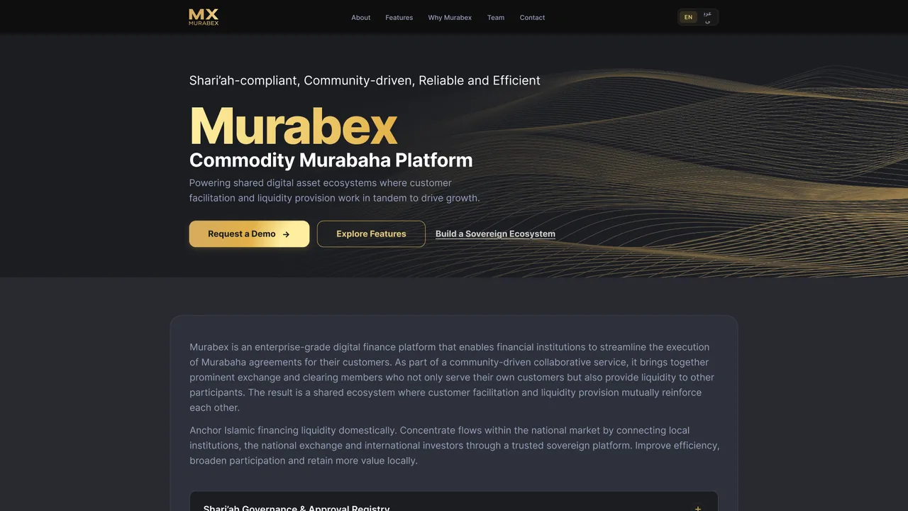
murabex.com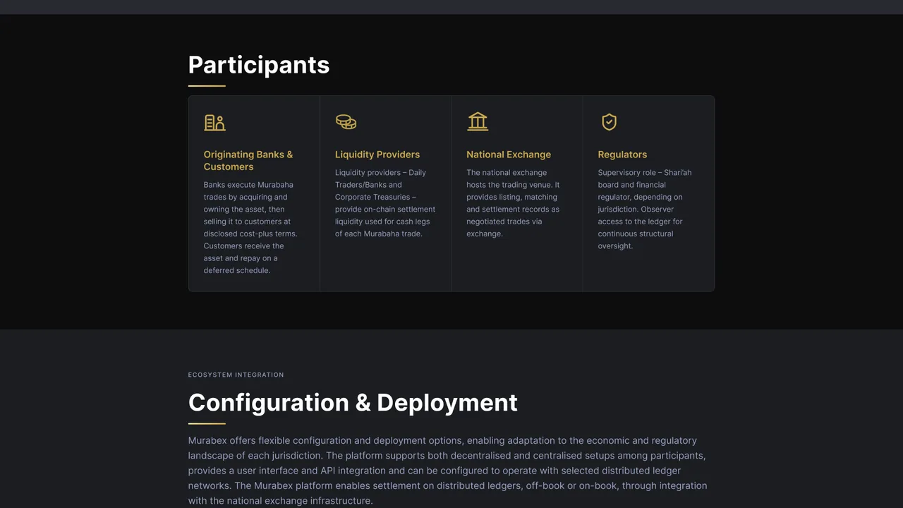
murabex.com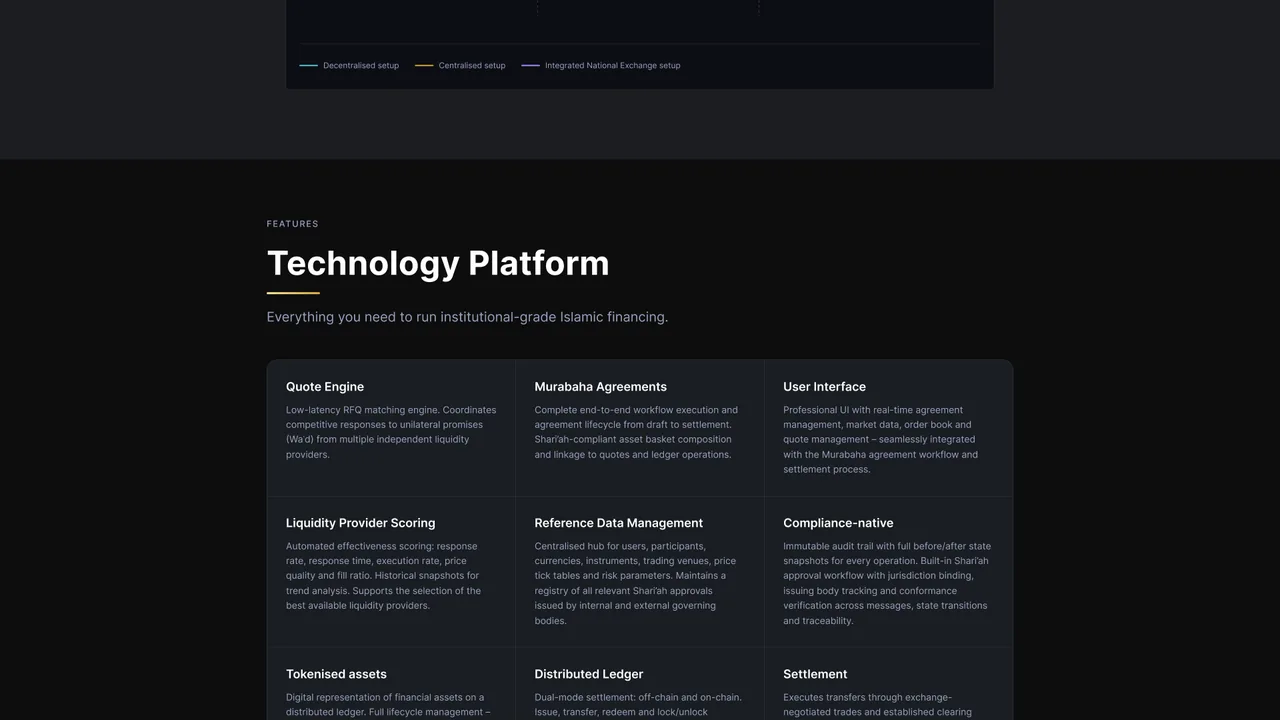
murabex.com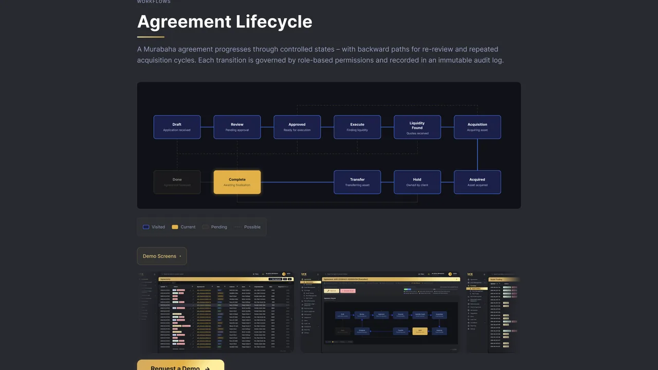
Murabex — product interface
An institutional interface for a regulated market.
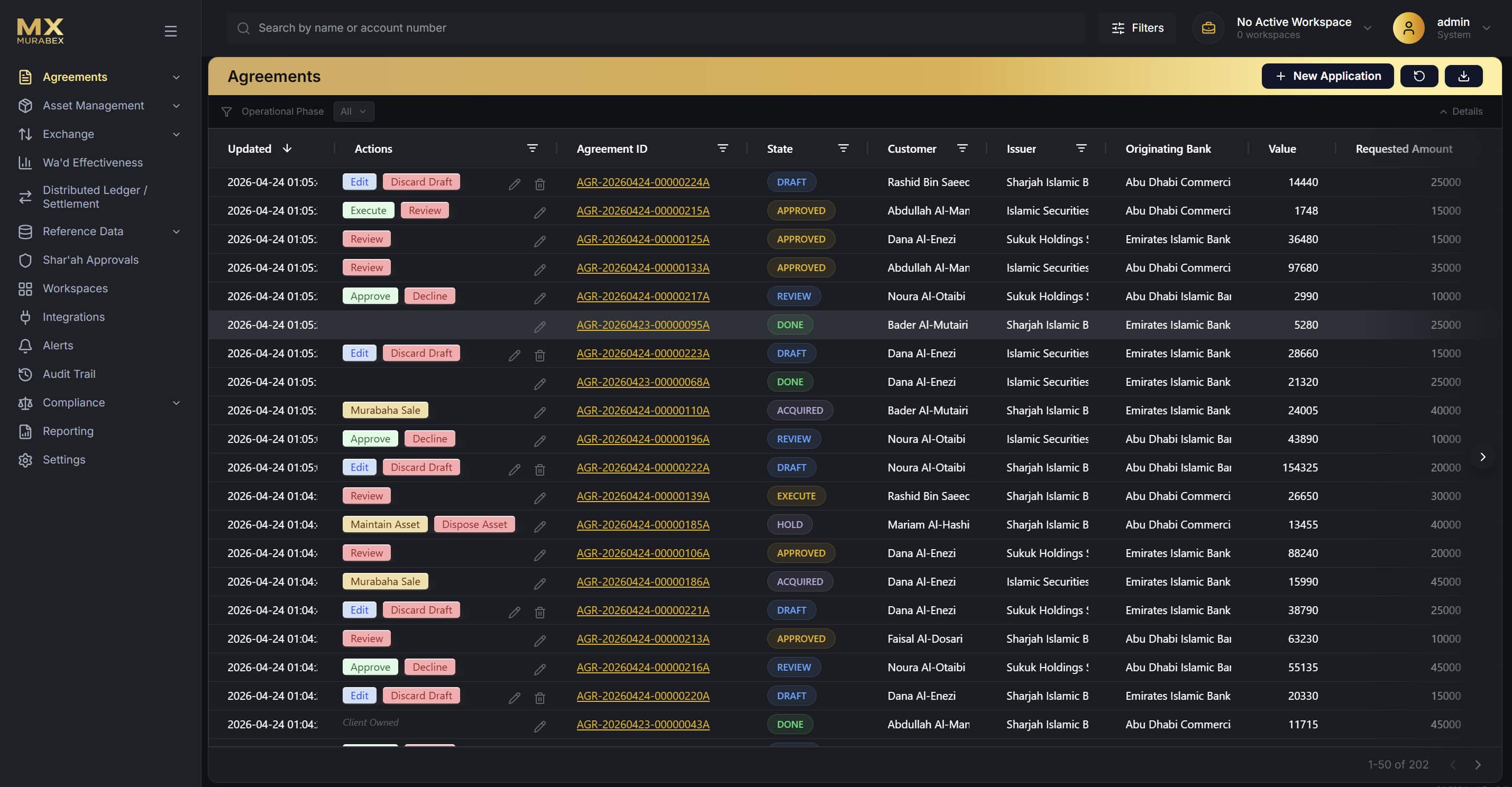
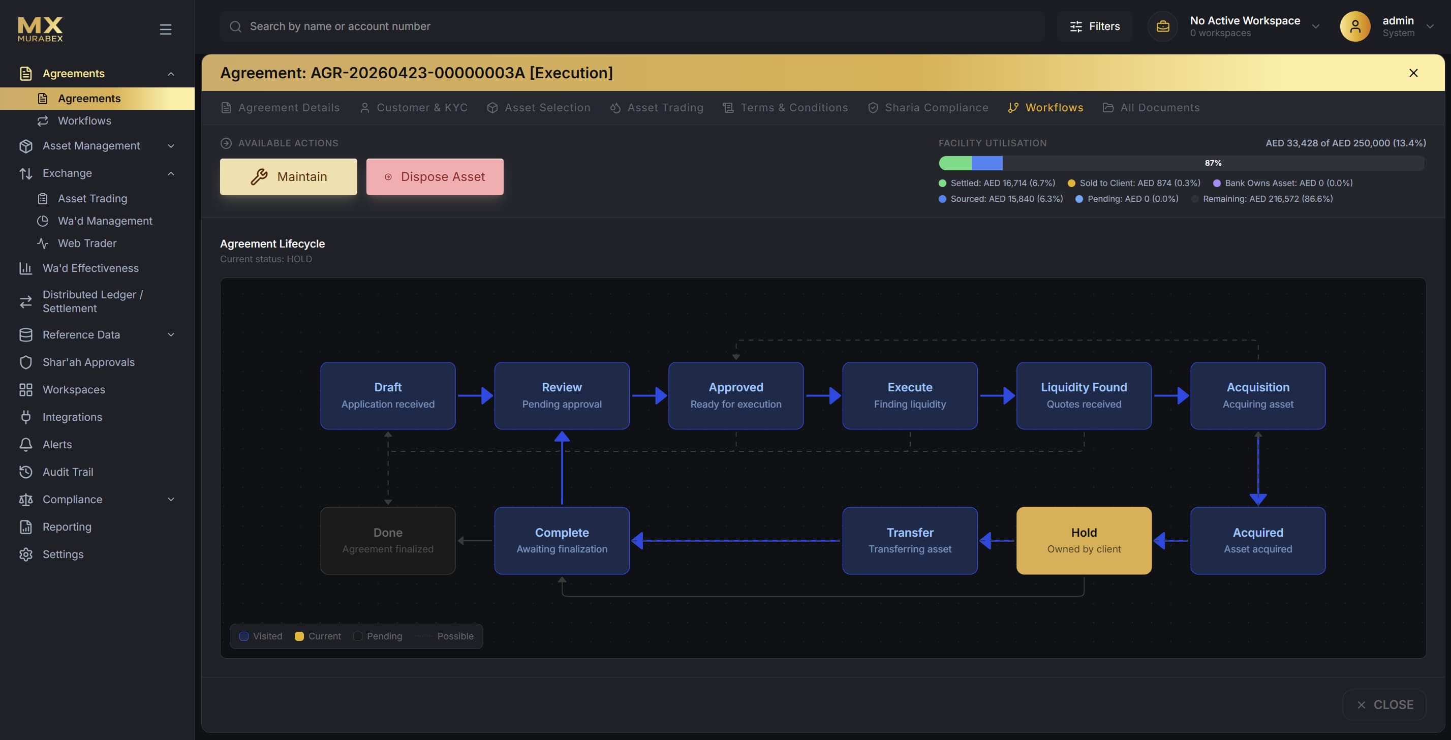
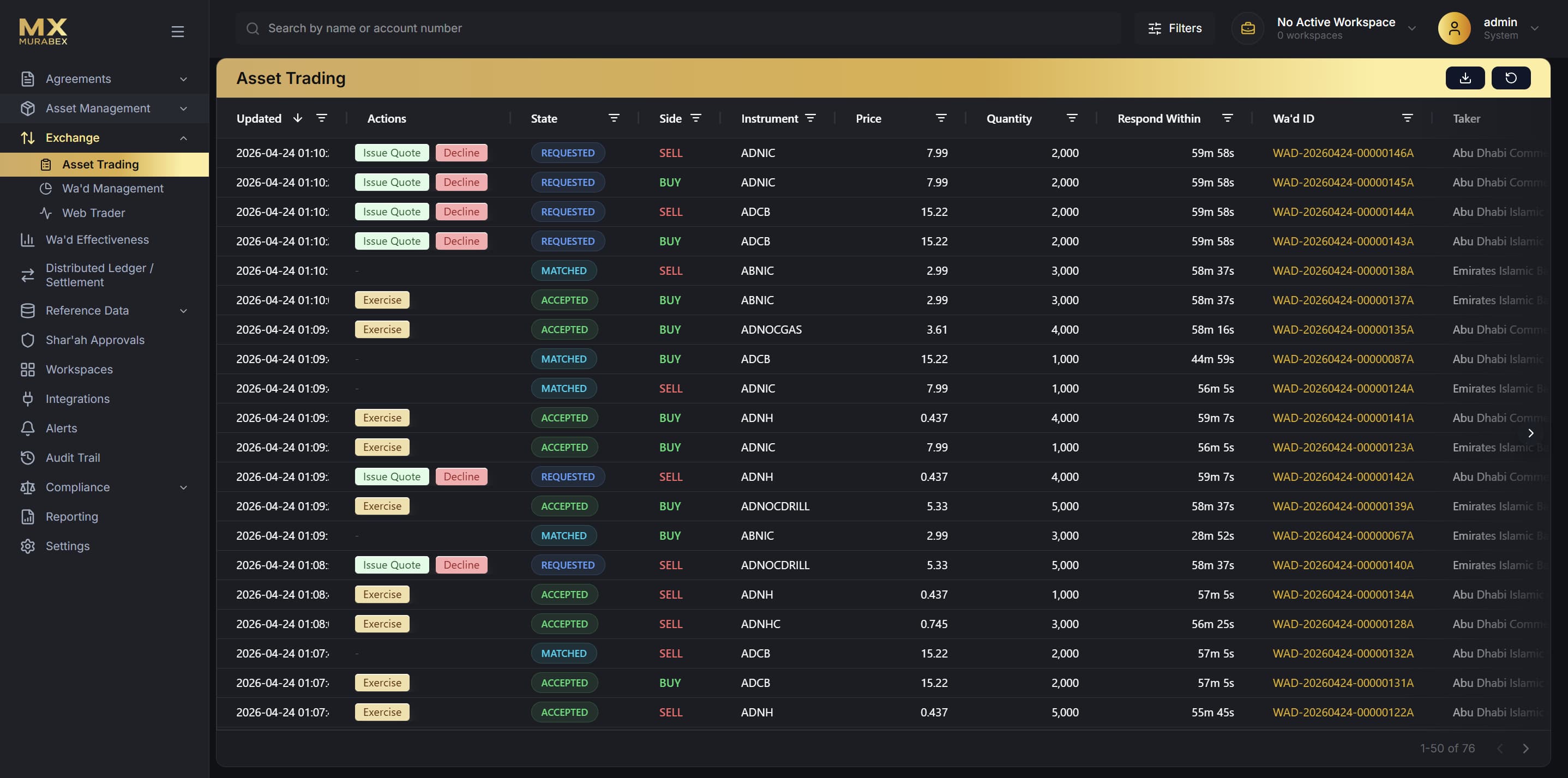
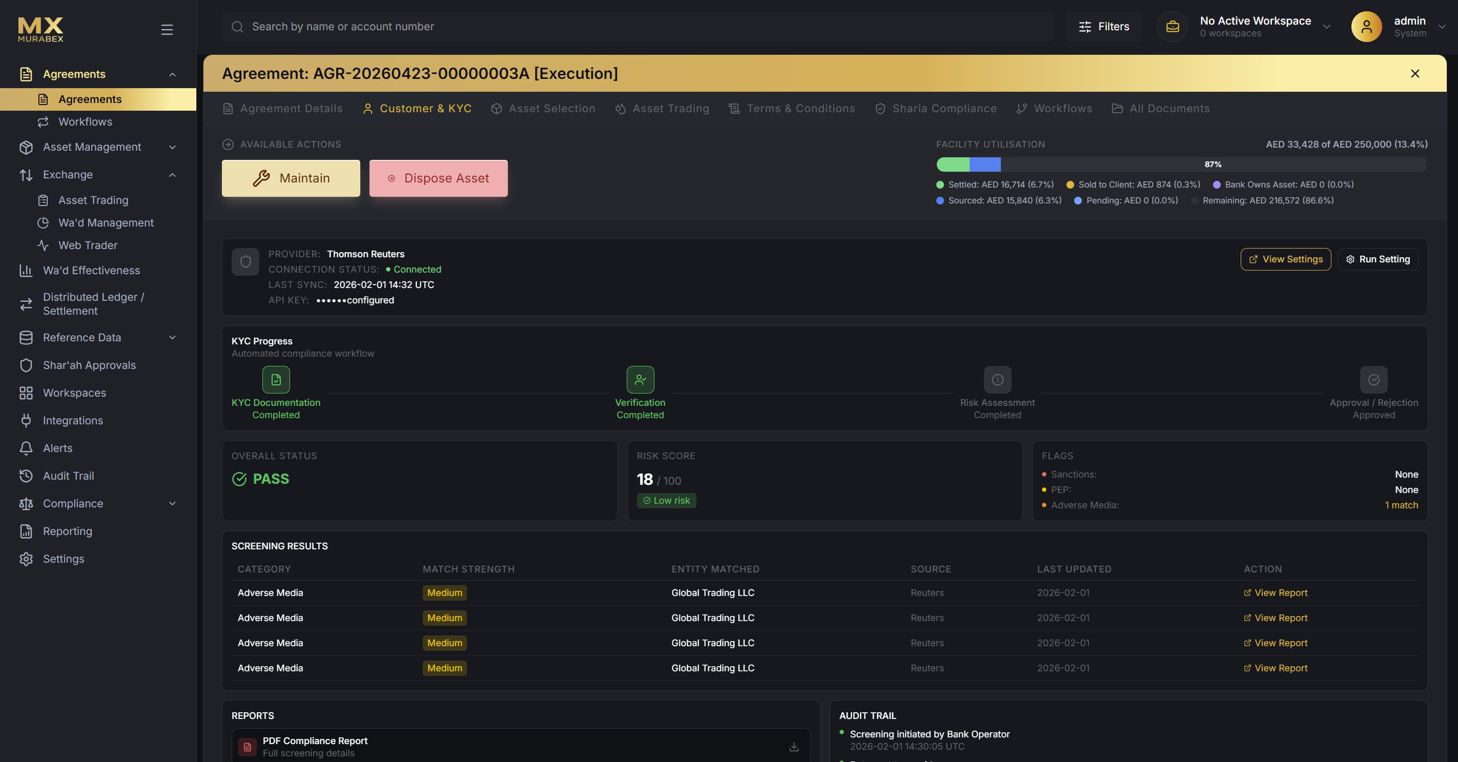
Four core surfaces carry the platform: an agreements dashboard, the full agreement lifecycle, a competitive asset-trading exchange, and an automated KYC and compliance workflow. Dense tables, status systems and state machines, kept legible through hierarchy and restraint.
A dark operator UI with gold as the single accent. Colour is reserved for meaning — trade sides, agreement states, risk and compliance signals — so a high-throughput system stays calm and scannable.